UX observation - keep tag cloud context
Installation and Configuration
Brian -
I thought about the names. It's the behavior: when you click on a tab in a tab panel, the idea is to switch between the tab panels.
When you click on tag cloud now, you break the UI/UX expectation by loading another page - all the tabs disappear.
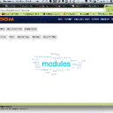
What I am proposing is to leave all the tabs in place and within the tab panel display the tag cloud in a row of tabs. Basically duplicate what you have at
https://www.jamroom.net/tags/documentation/modules without the Tag Cloud tab because it is in the parent tab row.
Nested tabs in other words. This makes the whole approach orthogonal.
Another UI thought on this page
Why not use the sort order icon here rather than a pick list? There are only two option for sorting that I have seen. More consistent with the rest of the UI.


 - 227KB


