solved Are there any plans to make jamroom Responsive?

Zachary Moonshine
Zachary Moonshine
@zachary-moonshine
10 years ago
831 posts
I get a lot of complaints from people using different sized screens that say they cant see the whole page and things are overlapping at first i didn't know what they were talking about but if you grab the edges of the screen and pull it in you can see and it is not just me i see it happens here as well ?
updated by @zachary-moonshine: 02/02/16 03:50:53PM
brian
@brian
10 years ago
10,149 posts
Jamroom is already responsive to screen size - there is nothing it can do however if the width of the CONTENT is wider than the screen - which is the case with your screenshot.

Let me know if that helps.


--
Brian Johnson
Founder and Lead Developer - Jamroom
https://www.jamroom.net
Zachary Moonshine
Zachary Moonshine
@zachary-moonshine
10 years ago
831 posts
that was the one cool thing about NING3 it seemed no matter what you put on it, it would make it responsive somehow?
Zachary Moonshine
Zachary Moonshine
@zachary-moonshine
10 years ago
831 posts
here is a screenshot of same page from a wide screen
brian
@brian
10 years ago
10,149 posts
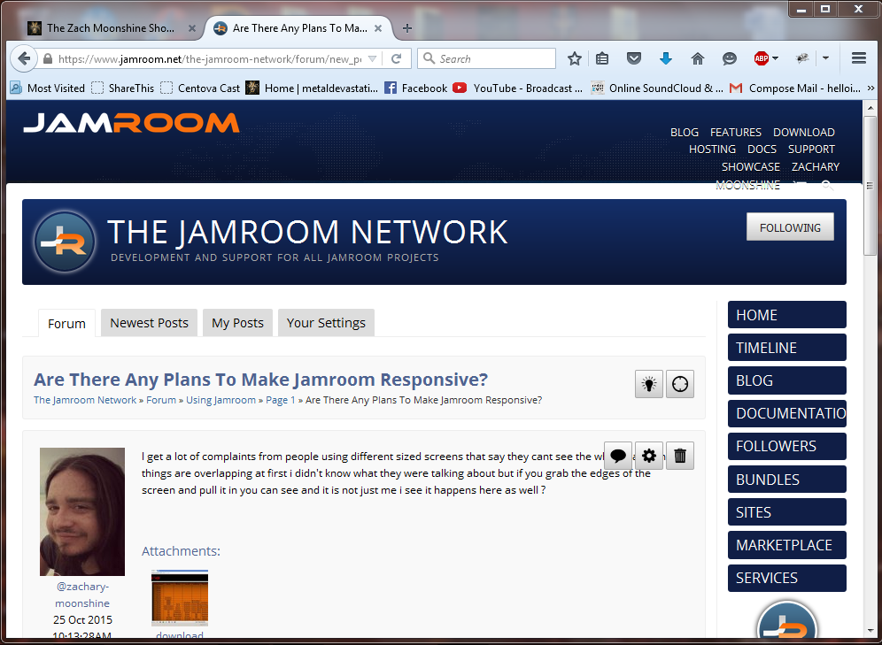
There's no way to make what you have posted responsive without mucking with the content. What you've posted is a TABLE, which is "naturally" responsive in that it will expand/contract to the size the HTML based on the contents of the cells in the table. In your screenshot the contents of your cells, when stacked side by side, are TOO WIDE for the container, so they overflow.

The only way to "fix" this is to:

- remove "nowrap" from any of the table cells if you have added it
- remove any non-blocking-spaces (nbsp) from the cell contents

That schedule is not something Jamroom generates, so you'll need to "fix" it.

Let me know if that helps clarify what the issue is.


--
Brian Johnson
Founder and Lead Developer - Jamroom
https://www.jamroom.net

updated by @brian: 10/25/15 10:23:55AM
Zachary Moonshine
Zachary Moonshine
@zachary-moonshine
10 years ago
831 posts
the menu is what grabs my attention most see here
Zachary Moonshine
Zachary Moonshine
@zachary-moonshine
10 years ago
831 posts
the table i have is just a png image a screen shot of my excel doc i made
brian
@brian
10 years ago
10,149 posts
Yeah that's responsive. I know the word "DOCUMENTATION" is cut off, but that's because there is no where to "BREAK" that word. And the top user menu has "overflowed" into the header.

These things can be "fixed" in CSS, but have to be handled on a case by case basis since it depends on the content.


--
Brian Johnson
Founder and Lead Developer - Jamroom
https://www.jamroom.net
Zachary Moonshine
Zachary Moonshine
@zachary-moonshine
10 years ago
831 posts
so basically any image you embed on jamroom is not responsive?
brian
@brian
10 years ago
10,149 posts
Zachary Moonshine:
so basically any image you embed on jamroom is not responsive?

No - they are all responsive - as long as they are using 100% width.


--
Brian Johnson
Founder and Lead Developer - Jamroom
https://www.jamroom.net
brian
@brian
10 years ago
10,149 posts
Go here and resize your browser:

https://www.jamroom.net/the-jamroom-network

and watch the images - they shrink and expand based on the width.


--
Brian Johnson
Founder and Lead Developer - Jamroom
https://www.jamroom.net
Zachary Moonshine
Zachary Moonshine
@zachary-moonshine
10 years ago
831 posts
ok so make all images 100% but the menu is a different story, i am not trying to give you guys a hard time i am just getting hammered by these angry people and dont know what to do
brian
@brian
10 years ago
10,149 posts
Zachary Moonshine:
ok so make all images 100% but the menu is a different story, i am not trying to give you guys a hard time i am just getting hammered by these angry people and dont know what to do

They are getting angry at you over this? wow. Sorry about that!

Jamroom is 100% responsive, but again it depends on the CONTENT. There are some things (like a table) it can't "force" responsive. If you see an image that is NOT responsive that has been added in my one of our modules let me know.

Hope this helps!


--
Brian Johnson
Founder and Lead Developer - Jamroom
https://www.jamroom.net
Zachary Moonshine
Zachary Moonshine
@zachary-moonshine
10 years ago
831 posts
when i go to embed media and upload the image how do i choose 100%?
Capture.PNG.png
Capture.PNG.png  •  25KB

Zachary Moonshine
Zachary Moonshine
@zachary-moonshine
10 years ago
831 posts
ok i figured it out i uploaded same image made it the biggest size available and made second option stretch and put no margin and presto now it is responsive
Zachary Moonshine
Zachary Moonshine
@zachary-moonshine
10 years ago
831 posts
dude i wish that was default for everything but now i know i can go back and fine tune all the images i have embedded
brian
@brian
10 years ago
10,149 posts
Zachary Moonshine:
ok i figured it out i uploaded same image made it the biggest size available and made second option stretch and put no margin and presto now it is responsive

Yep - stretch is the one. If you choose a specific pixel size then it will always show at that size.

Glad you got it working.

Thanks!


--
Brian Johnson
Founder and Lead Developer - Jamroom
https://www.jamroom.net
Zachary Moonshine
Zachary Moonshine
@zachary-moonshine
10 years ago
831 posts
and yes i know its silly people get mad at me over anything hahahahha they expect everything to be perfect as if i am a magician or something but anyway this will help now the only issue is the menu
Zachary Moonshine
Zachary Moonshine
@zachary-moonshine
10 years ago
831 posts
i just shortened my menu drastically so that takes care of that